

UX Case Study: Sendwave
Overview
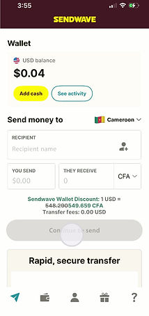
Sendwave is a mobile app that enables users to send money internationally. I use the app regularly to send money to family and friends. Through repeated use, I identified a recurring friction point in the experience: resending money to an existing recipient.
Problem*
Resending money feels unnecessarily time-consuming. Users must re-enter transaction details or navigate through multiple steps to access the resend option, creating friction and frustration—particularly for frequent or habitual transactions.
Problem Statement
Sendwave lacks a fast, intuitive way to resend money to an existing recipient.
*This case study reflects the state of the product as of February 14, 2026.

Screen recording
Goal
Design a solution that allows users to quickly resend money with minimal steps, reduced cognitive load, and clear feedback—without re-entering information or navigating multiple screens.
Solution
-
Introduced a clearly visible “Resend” action adjacent to existing recipients to support repeat behavior and reduce friction, enabling users to initiate transactions instantly and improving overall efficiency.
-
Designed and implemented subtle micro-animations that enhanced user delight while delivering functional value through real-time visual feedback and clear transaction status updates, reducing user uncertainty.
-
Developed an intuitive post-transaction action menu to encourage continued engagement.
Before / After (Visual Framing)
Before
-
3–4 steps to resend money
-
Higher cognitive load
-
Slower repeat transactions
After
-
2 steps to resend
-
Clear visual continuity
-
Faster, more confident transactions

Micro-animation that provides visual feedback while the transaction is processing.
After Effects Prototype

Micro-animation that delivers visual feedback confirming successful transaction completion.